Figma Integration: From Embeds to a Real Design Model
Connecting Figma components to their coded counterparts, with stable references that survive file changes.
Knapsack is a B2B enterprise SaaS platform for design systems — software that helps product teams build, document, and publish their design foundations at scale.
01 — Overview & Problem
What we were trying to solve
Knapsack already had a way to bring Figma into documentation: teams could create iframe embeds of frames, prototypes, and components. It worked, but it created as many problems as it solved. Iframes were heavy, didn't behave well inside structured documentation pages, and had no awareness of what they were embedding. A frame was just a URL, with no concept of what component it represented or where it sat in the file.
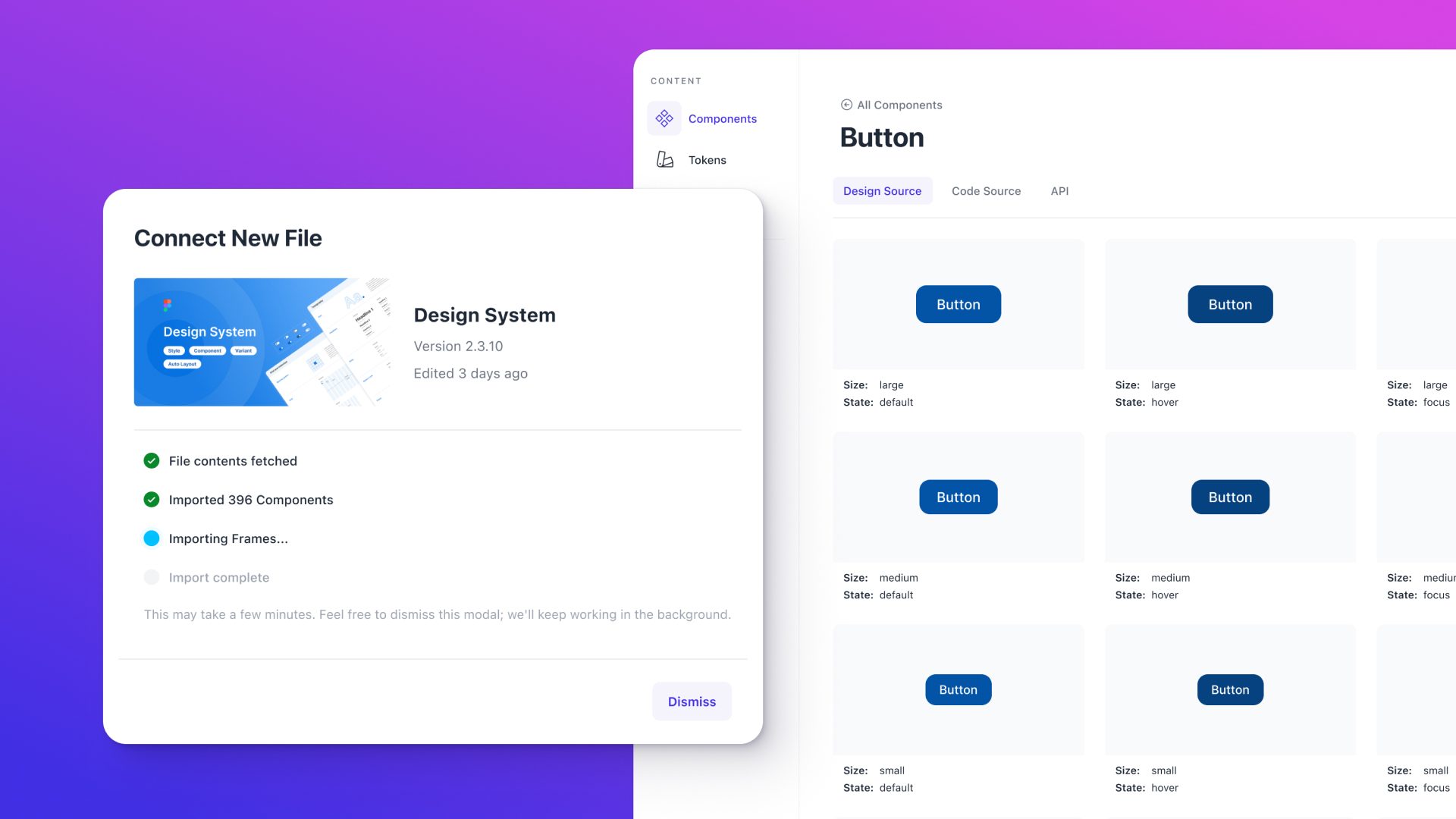
Screenshots were the other workaround. Designers exported images, authors pasted them in, and docs looked right until the design changed. No signal when something drifted, no way to update without repeating the process. Neither approach had any concept of stability. When a designer moved a frame or updated a component, anything referencing it either broke or changed without warning.
Beyond the documentation problem, Knapsack components and Figma components existed in complete isolation. A button in code had no relationship to the button in Figma. A component page couldn't say "this is the Figma component for Button," only "here's an iframe that happens to show one."
We needed Figma to be a structured data source inside Knapsack, not just a place to grab embeds from.
02 — My Role & Team
Where I fit in
As Director of Product Design, I owned product definition, UX, and cross-functional alignment end to end, defining the data model, designing the selector experience, and specifying how Figma nodes would integrate with Knapsack's existing content block system.
I worked closely with engineering throughout, defining the node model and API contract early so the team could build against a stable spec, and collaborating on tradeoffs around sync performance, thumbnail caching, and graceful degradation. I also drove alignment on scope: what the integration needed to do in v1 and what we were deliberately leaving for later.
I owned the design and built the foundational UI surfaces for the integration, then collaborated with full-stack engineers on the API layer and the work that followed. That meant navigating both the user-facing experience and the underlying data model simultaneously, making sure the structure we were building for engineering was one that could actually produce a good authoring experience.
03 — Process
How I approached it
I started by mapping what teams actually needed from Figma inside their docs. Design system owners, content authors, and developers all had different jobs: connecting files, browsing and selecting the right node, and embedding or referencing it in a way that would stay stable as the design evolved. Those jobs shaped everything that followed.
Three constraints shaped the design from the start. First, Figma's hierarchy (file, page, frame, component, variant) had to be respected rather than flattened. Fighting the tool's own structure would make the integration fragile. Second, large Figma files meant we couldn't load everything naively; we needed a clear model of what to sync and when to refresh. Third, whatever we built had to work within Knapsack's existing block-based documentation model.
From there I moved into structure: defining a unified node model with a stable id, name, type, URL, breadcrumb path, and optional thumbnail, then designing the selector experience that would make that model navigable for authors without requiring them to leave Knapsack or manage URLs manually.
I validated the tree-based browsing approach with internal users and design system teams early, focusing on whether navigating the file hierarchy was more reliable than search-only or link-pasting for finding the right frame or component in a large file.
04 — Key Decisions & Tradeoffs
The calls that mattered
A browseable selector over paste-a-link
The link approach would have been faster to ship, but it would have kept the burden entirely on authors: know the right link, keep it updated when files changed, re-paste when it broke. The selector inverted that. Authors browse connected files, pick the node they want, and Knapsack holds the stable reference, one selection experience that could serve multiple block types and future surfaces, rather than a per-block URL field each team had to manage themselves.
Snapshot model over live sync
A live sync would mean designs could change underneath documentation at any time, with no signal to authors and no control over when updates landed. The snapshot model solved that differently: Figma content stays stable within a Knapsack branch until an author deliberately triggers a sync. Nothing updates without someone deciding it should. That's the same kind of intentionality the branch workflow gave authors over documentation changes.
Components and variants as first-class node types
Treating components and variants as distinct node types rather than flattening everything to "frame" was more complex to build but essential to the project's goal. The difference between "show this frame" and "document this component" is meaningful for design system teams. Building that distinction into the node model from the start meant the integration could support proper component documentation rather than just visual embedding.
Linking Figma components to Knapsack components
Once a Figma component was linked to its Knapsack counterpart, its properties and variants were automatically mapped to the coded component's props and API. That mapping surfaced as a structured data view directly on the component page: design spec and coded spec side by side, without leaving the doc, without manual syncing, without a spreadsheet.
05 — Outcomes & Results
What actually shipped
Design Source management and sync
When a Figma file is connected, Knapsack pulls the content via the Figma API and stores it in its own system. Authors work from that snapshot within their branch, so designs don't change underneath them mid-edit. When they're ready to incorporate updated Figma content, they trigger a manual sync.
Figma-to-Knapsack component linking
Once a Figma component is linked to a Knapsack component, the integration automatically maps Figma component properties and variants to the coded component's props and API. Teams get a structured, always-current view of how the design spec relates to the implementation, directly on the component page.
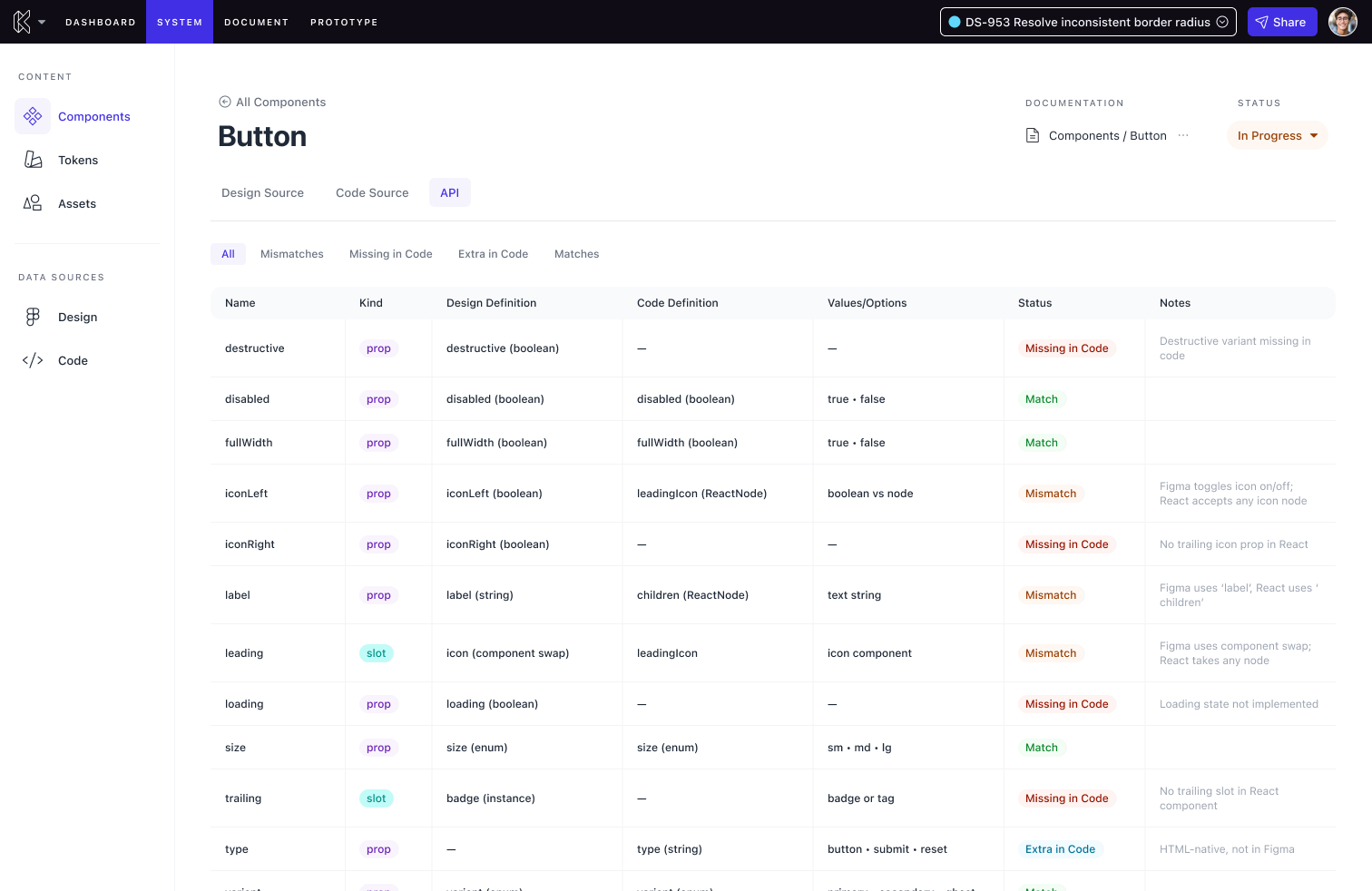
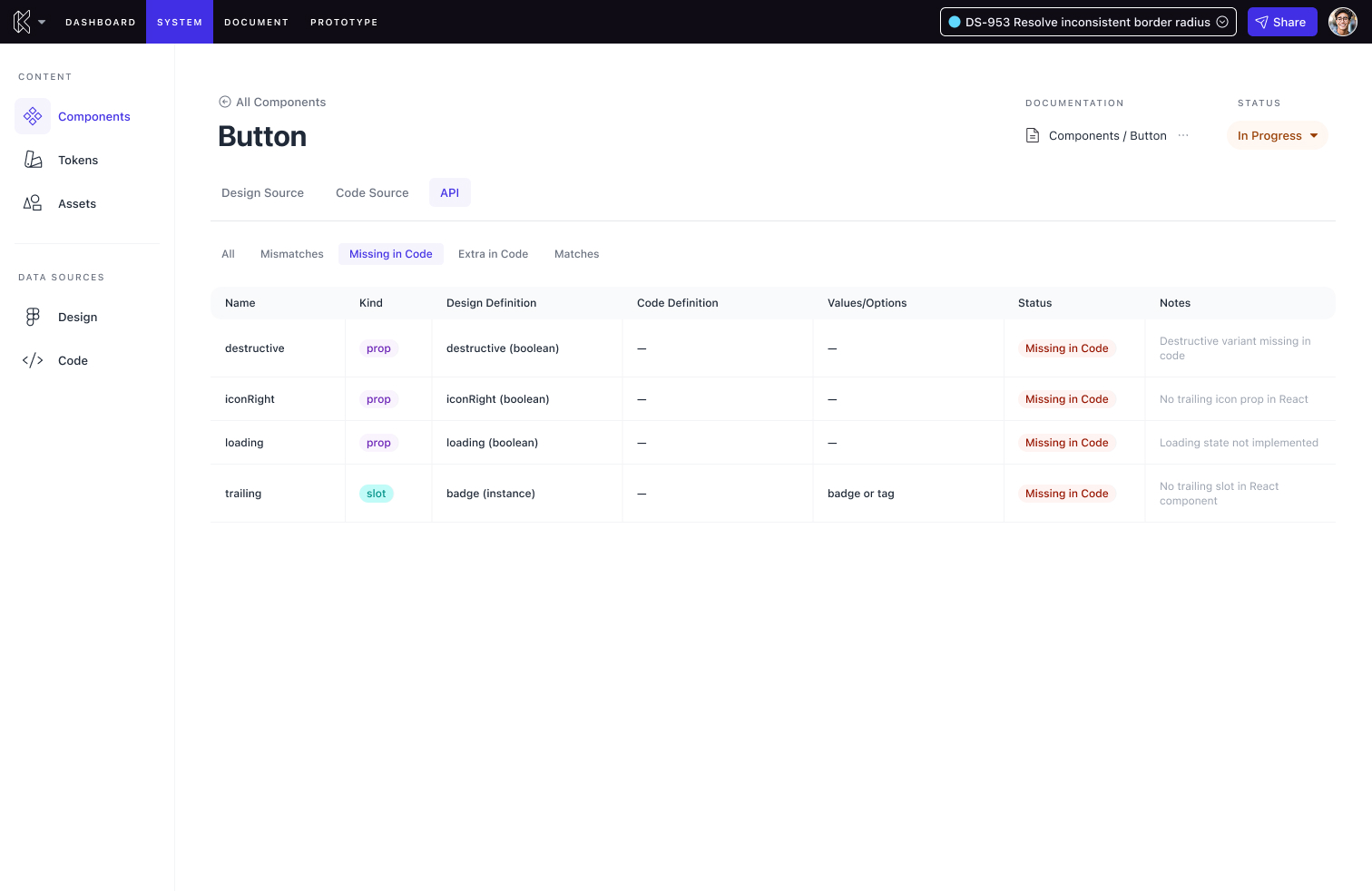
Teams that had been working around iframe limitations had a structured, stable way to connect their Figma work to their documentation. For the first time, teams could see their design spec and coded spec side by side in a single view.
Documenting Figma Assets in Knapsack
To support the integration, two new block types shipped alongside a new design source selector: an in-app browser that lets authors navigate connected files, expand the tree from page down to component and variant, and select a node without leaving Knapsack or managing a URL. The new blocks included a tiles block for displaying a set of frames or components as a visual grid, and a component block for documenting a specific Figma component with its variants and usage context. The existing embed block remained for teams who still wanted full iframe embeds.
06 — Lessons Learned
What I'd do differently
I'd push for earlier alignment on the data model with engineering. We got there, but some of the most productive conversations happened later than they should have. Defining the node model as a shared artifact upfront, not just a design spec, would have compressed the back-and-forth during implementation.
This project reinforced something I've carried into every integration feature since: model the domain the way the tool does. Figma's hierarchy had its own logic, and the moment we tried to simplify or abstract it too early, the design got harder to reason about. Respecting the source system's structure, then designing a good experience on top of it, is almost always better than flattening it prematurely.
The snapshot model has also become a default for me on any platform work where an external source of truth exists. Designing for intentional sync keeps documentation honest and prevents the silent drift that comes from treating a live feed as a feature rather than a liability.