Vivid Seats App 3.0: An App Worth Coming Back To
Redesigning the Vivid Seats app to create reasons to return, not just reasons to convert. A cross-functional project spanning product, engineering, and marketing.
01 — Overview & Problem
What we were trying to solve
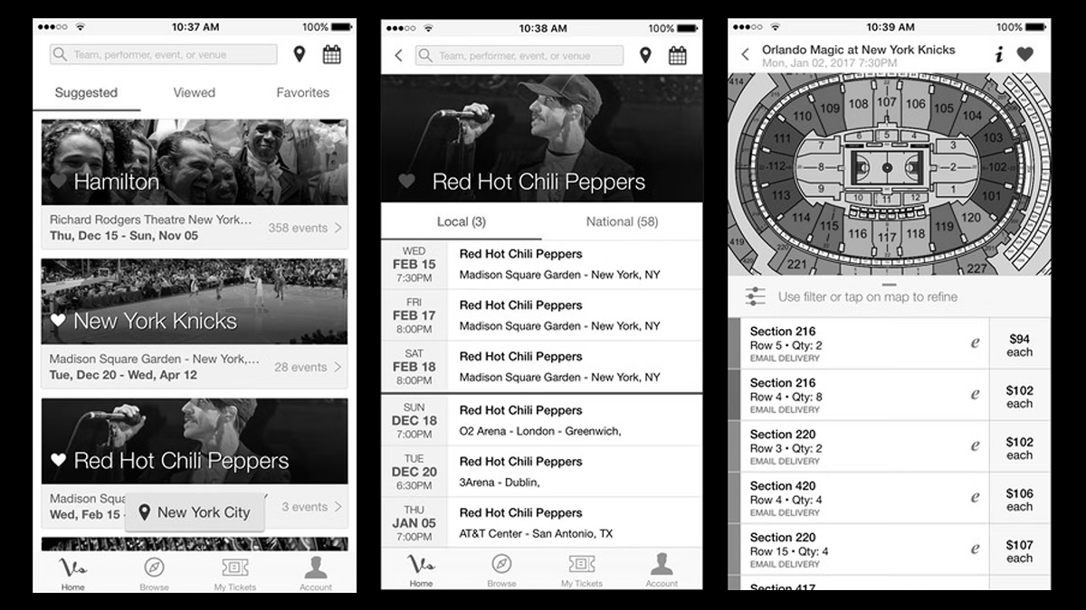
In the summer of 2020, the Vivid Seats app was already the company's best-performing product, but it functioned almost entirely as a transactional tool. Users showed up to buy tickets, then left. There was no reason to come back unless you were ready to buy again.
The problem was that users had no reason to open the app unless they were buying tickets. A ticket marketplace that only surfaces value at the moment of purchase misses everything in between: discovery, wishlist behavior, social sharing, loyalty. The challenge was to design an experience that created reasons to return, not just reasons to convert.
The project also required real cross-functional alignment. Product, engineering, marketing, and senior leadership each had different definitions of success.
02 — My Role & Team
Where I fit in
I led this initiative as Manager of Product Design, owning the design process from facilitating stakeholder workshops through to building components into our new Roadie Design System. A distinct part of my role was translating what we learned from users into something leadership could act on, turning open-ended ambitions like "increase engagement" into concrete, testable feature concepts.
03 — Process
How I approached it
We started with a competitive analysis that looked beyond the ticketing industry: any product known for pulling users back regularly, looking for patterns in personalization, community features, and reward mechanics that weren't tied directly to a primary transaction.
From there, we went directly to users. Surveys to understand what drives habitual product use, followed by unmoderated sessions to pressure-test specific concepts.
The research confirmed that users wanted a sense of ownership and continuity: a place that remembered them and gave them a reason to return.
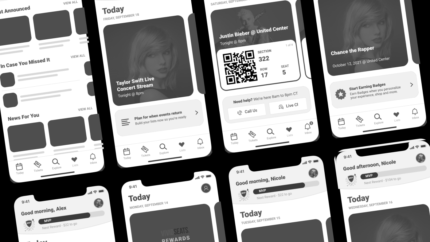
With that direction established, my team moved into low-fidelity wireframes, iterating on each feature area and building prototypes for usability testing with internal users before moving into high-fidelity UI.
04 — Key Decisions & Tradeoffs
The calls that mattered
Rethinking the home screen as a personalized feed rather than an improved list
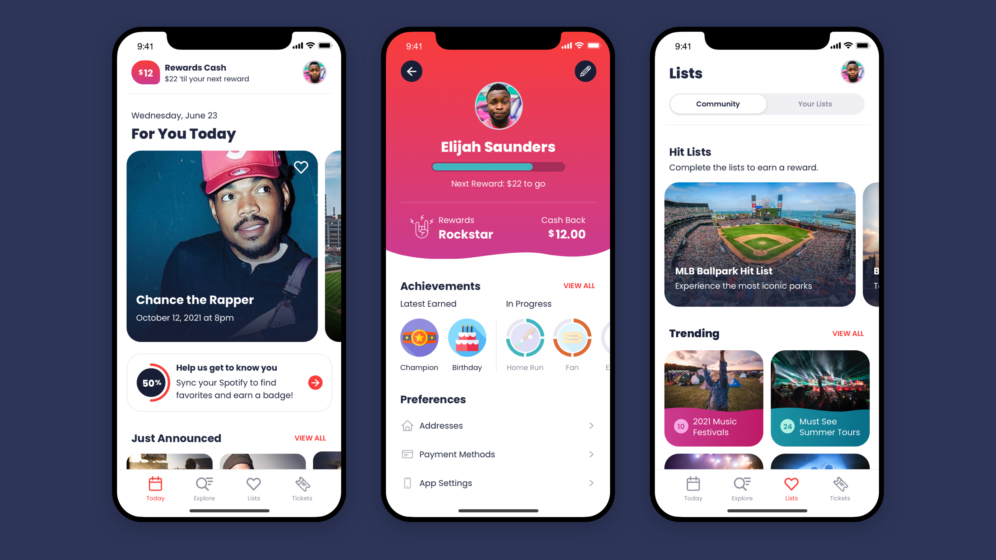
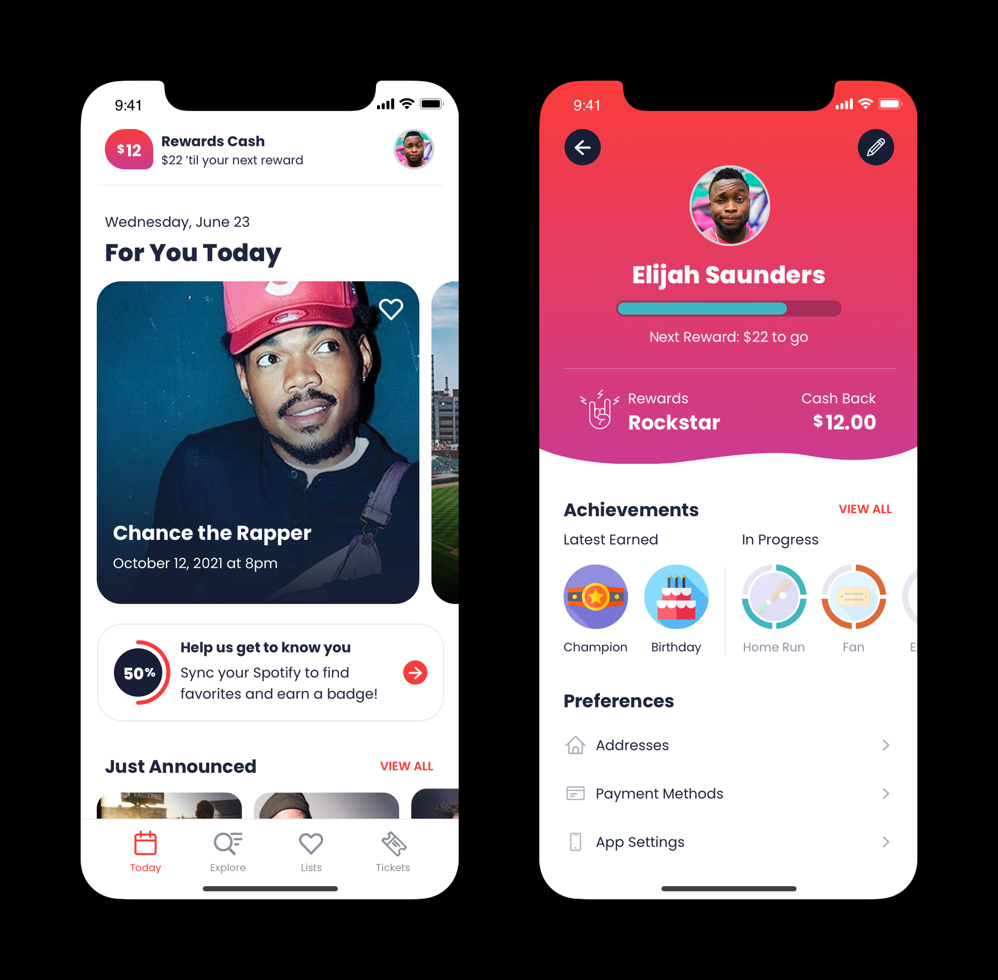
We could have improved the existing event list: better filtering, better search, cleaner UI. Instead, we redesigned the home screen as a dynamic feed: events, nudge units, and content tailored to each user. A list-based home screen would never give users a reason to come back. The existing model was optimized for conversion; we needed one optimized for relationship.
Integrating rewards into the profile rather than leaving it isolated
The loyalty program had previously lived in its own section of the app, separate from everything else. We moved it directly into the user profile and expanded it with an achievements concept that rewarded engagement behaviors beyond purchases, making rewards feel personal rather than transactional. The loyalty experience was anchored to a user's identity rather than a tab they might never visit.
05 — Outcomes & Results
What actually shipped
For You Today
We shipped a redesigned home screen with a dynamic feed of events, nudge units, and personalized content, along with a restructured loyalty experience integrated directly into the user profile and a new achievements system that rewarded engagement beyond purchase behavior.
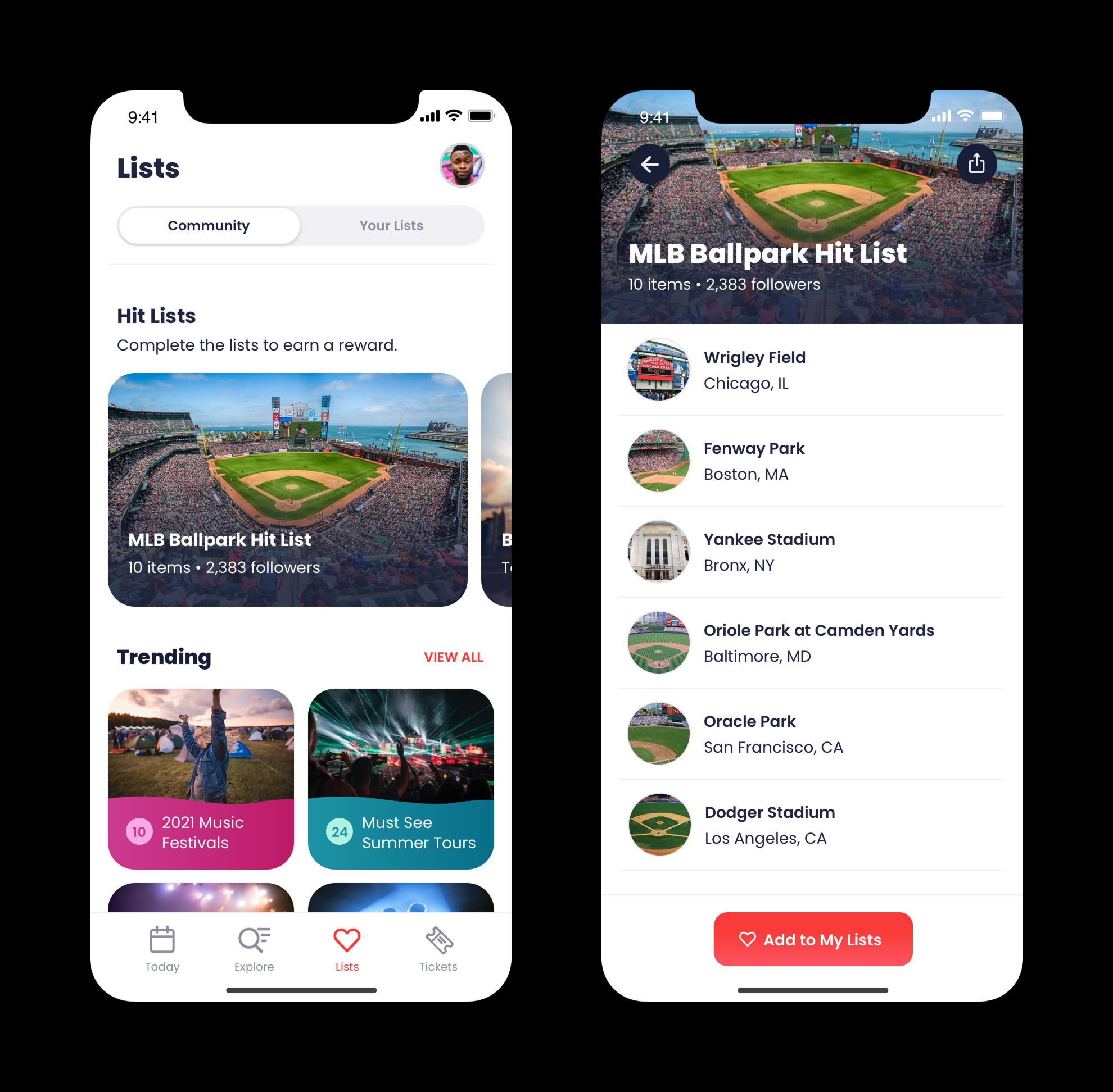
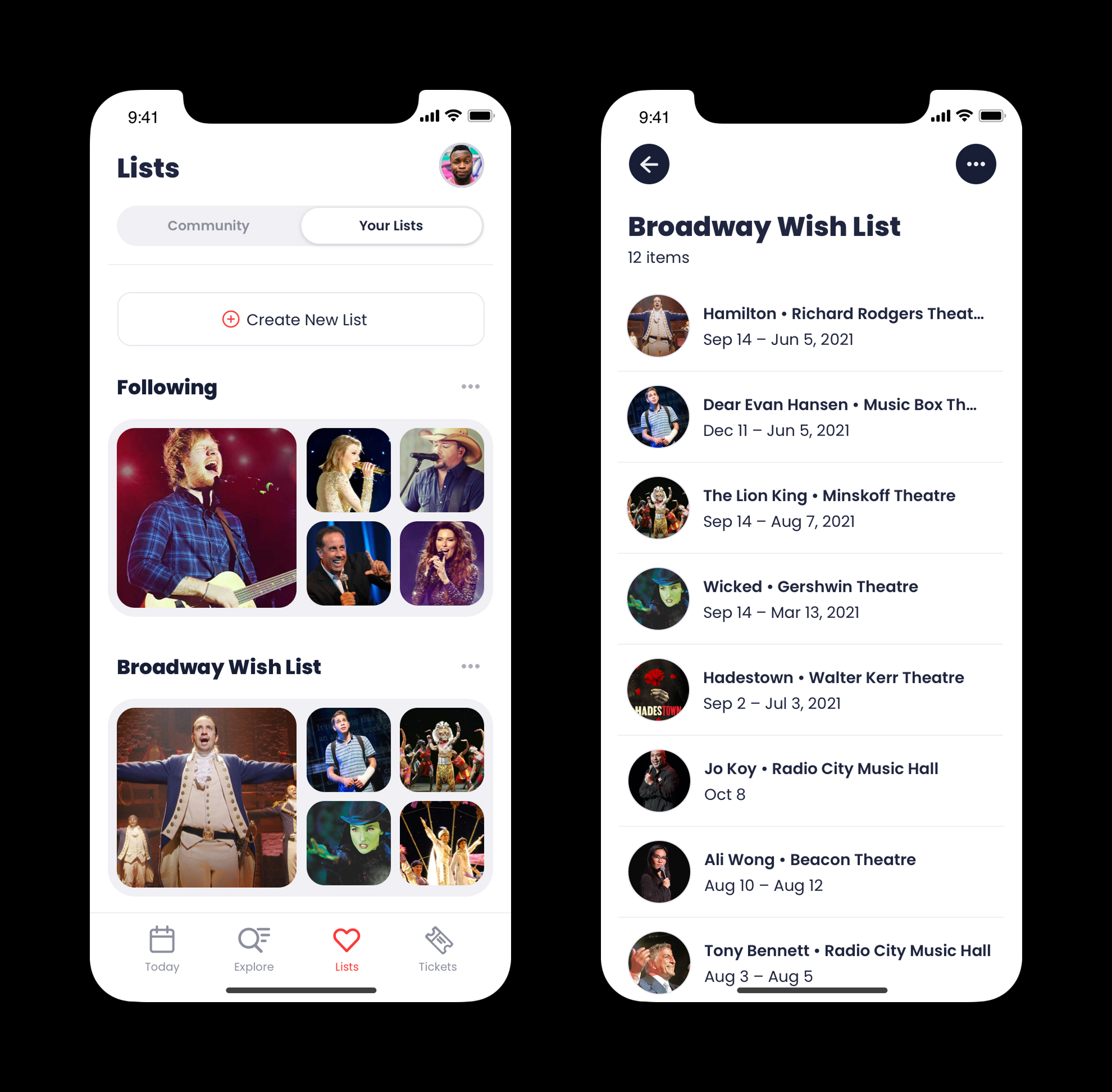
Curated & Custom Lists
Designed and handed off as part of this initiative. The feature shipped after I moved on, but the core concept and UX were completed under my ownership.
06 — Lessons Learned
What I'd do differently
With hindsight, I'd invest earlier in defining success metrics for each feature before the design process began. "Increase engagement" is a valid north star, but it's broad. Sharper KPIs per feature (return visit rate, rewards check-ins, list creation rate) would have made usability testing more focused and post-launch evaluation more rigorous.
This project reinforced the value of facilitated workshops as a design tool, not just for alignment, but for surfacing constraints and ideas that wouldn't come up in standard design reviews.